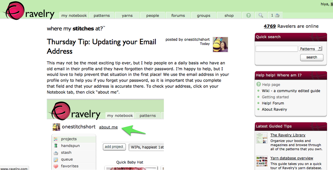
|
This case study occurred in 2014 as an assignment during my doctoral studies for a course on Human-Computer Interaction. User testing occurred within the class setting, using Long Island University's usability lab. As this was a class project with time constraints, it utilized a small sample size and short list of tasks.
Note: Ravelry.com has undergone extensive site updates since this study took place, and the results herein apply to their old design and system. |
ABSTRACT
Ravelry.com is a niche website for individuals who knit and crochet. It combines organizational elements with social networking. The site contains a large database of patterns as well as groups, message boards, and a notebook section in which users can organize their projects, patterns, books, tools, and yarn. This paper focuses on the usability of the notebook section, and looks at it from a theoretical perspective as well as via usability testing. Three individuals participated in this study, resulting in suggestions that the site is aesthetically pleasing but could be improved if it included tutorials for beginners. Participants also indicated that some aspects of the site are not intuitive, and that it is likely more useful to someone more experiences in knitting and crochet.
SUMMARY
Product: Ravelry.com
Objectives: Assess the usability of the existing website for individuals of varying skill levels. Specifically this study looks at the "Notebook" feature, where a user can store patterns, favorites, projects, and other information in addition to their profile.
Methods:
Findings: Of the five tasks given, four were completed by 100% of the participants. The remaining one was completed by 67%. They rated the difficulty of the different tasks, ranking the process of adding needles and hooks to the notebook as the most difficult. Participants mentioned liking the layout and being able to see projects created by others for inspiration, but did not like the search features and felt some of the links were not intuitive.
Recommendations: The needles and hooks feature was confusing for some, and could be redesigned to be clearer. Additionally, the "quick search" feature did not yield the appropriate results when searching for a type of yarn, and should perhaps be reworked to provide a more comprehensive search. Further study into the intuitiveness of the design may also be beneficial.
Objectives: Assess the usability of the existing website for individuals of varying skill levels. Specifically this study looks at the "Notebook" feature, where a user can store patterns, favorites, projects, and other information in addition to their profile.
Methods:
- Usability analysis
- Theoretical framework
- User testing
- Task-oriented
- Think-aloud protocol
- Survey
Findings: Of the five tasks given, four were completed by 100% of the participants. The remaining one was completed by 67%. They rated the difficulty of the different tasks, ranking the process of adding needles and hooks to the notebook as the most difficult. Participants mentioned liking the layout and being able to see projects created by others for inspiration, but did not like the search features and felt some of the links were not intuitive.
Recommendations: The needles and hooks feature was confusing for some, and could be redesigned to be clearer. Additionally, the "quick search" feature did not yield the appropriate results when searching for a type of yarn, and should perhaps be reworked to provide a more comprehensive search. Further study into the intuitiveness of the design may also be beneficial.
Your browser does not support viewing this document. Click here to download the document.
